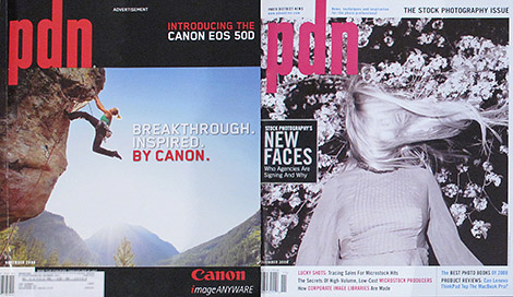
Actual Cover on the Left, True Cover from Page One on the Right
I received my November Photo District News today and was immediately confused. It was underneath some mail in our front entryway. We have a mail slot in our door so all mail falls to the floor. Wiping the mail aside I saw the PDN logo, the date, the magazine’s bar code and the USPS mailing label but it looked to be a Canon ad. Hmmm… must be the back side. I flipped it over. Nope, that’s a Leaf ad on the other side. That’s odd. Maybe it’s a special advertising issue? Open it up, nope again, it’s a regular issue but the cover is not on the cover. The actual cover is an ad; it’s not an insert, a tear-away ad nor on a different paper stock to separate it from the magazine. The cover is an ad. The true cover is on what would be page one. What?
In the scheme of things (two wars, a financial crisis, an election) this is not a big deal but I found it disconcerting. An ad on the cover, better yet, not an ad on the cover but an ad as the cover. It made me wonder what that says about a magazine. Is the magazine sending out a message that its content is secondary to its advertisements? Isn’t the reason people subscribe to magazines for the content? Is it an example of a magazine taking advantage of its subscribers? I’m sure the magazine cannot use this setup on a newsstand so then it would just be using it for its subscribers. To me this is as annoying as when you go to a web site and it presents you with a full-page animated ad and has a “skip this ad” link in the top right corner. Why do I have to go through an ad to get to the cover to get a sense of what the magazine has in store for me when I’m a paid subscriber?
Got my copy today. I’d say the scenario played out exactly the same way. I’m not sure why but I also found it incredibly annoying. As far as advertising space goes I suppose that’s some pricey real estate. Overall it made the magazine look a little desperate in my eyes.
Let’s hope this isn’t the start of a new trend.
mp
Glad I’m not the only one. I agree that it makes the magazine look desperate.
Trade magazines in general have never been known to have the strictest separation editorial content and advertising but this seems to erode the wall between them even more.
Last thing: maybe it’s different for the young’uns who have grown up in the Internet age but as one who grew up in the print age this seems to undermine the whole concept of a magazine cover. It also diminishes the magazine’s brand. Who are they and what do they stand for if the cover with their logo, purposely made to feel like a cover, is an ad? It’s a bad move on PDN’s part. Hopefully, it’s a just a test. If they continue to do this they’ll certainly lose this subscriber of 20 years.
Photo Depression News
For years, it was NY centric.
Bad fact checking, way too many contests, way too many favorite photographers, way too much kiss-ass on the blog of the “in the moment bloggers”.
If I see another quote about Vincent, Chase, John or whoever, on the blog, I am not going to renew.
My renewal notice came the last week and I am not sure if I will renew. If I do, it will be with the association discount. No way, am I paying full price for PDN.
Ya know I was looking for the November issue since October and none of the bookchains or camera stores in my big city had it. When the October issue ran out they never received the November. I looked daily in November and even up to today(December 15).Odd or maybe they just printed enough for subscribers and certain BIG traffic camera stores.