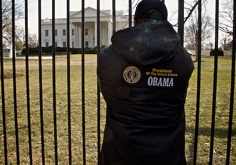
I was in Washington, D.C. last weekend and in a rarity had the afternoon to myself. No obligations, no kids in tow. I decided to go downtown, walk around the White House, take in the atmosphere, and also take in the Avedon show, Portraits of Power, at the Cocoran.
Avedon was on my mind because of Kander. Nadav Kander had just done an extended photo essay in the New York Times magazine, Obama’s People. The essay was a point of discussion in our house. Were the photos good? Did the essay work? Was it worth all the effort? I wasn’t sure myself. I liked some of the images but overall it didn’t come together for me. I didn’t glean anything from the images as a group. Now, that’s not to say that Nadav Kander isn’t an amazing photographer, he is. And that’s not to say that the New York Times Magazine wasn’t pushing the envelope a bit here, it was. But it was as if a risk had been taken, which was great, but it didn’t completely pan out. So, the magazine had to run with it because they had already committed to it.
The Kander photo essay is direct descendant from some of Avedon’s work. Seeing the two close together helped me get at what was bothering me about the Kander spread. The Avedon portraits are gorgeous – the tonality, the detail, the framing. Whether you like them or not conceptually there is an aesthetic element to draw you in. The Avedon portraits, too, are respectful of the subject. Even if Avedon has caught an odd moment or presents someone in a less than flattering way there’s a connection that occurs. The Kander work, in contrast, has many images which seem to have been chosen because they are odd for the sake of being odd – the Samantha Power portrait is one example. There’s not a lot to draw you in aesthetically and there’s nothing gained emotionally. I know he may be after more of an anti-aesthetic point of view but it’s hard to see the payoff when the subjects are real people (as opposed to something staged like a fashion spread.)
The kicker for me in all this was this week’s New Yorker. It has a small Platon photo essay, First Dance, of guests and performers who attended the inaugural balls. It’s fun and engaging. In subjects from young to old, everyday to famous, it captures the exuberance of this moment in time.
After reading your post, I thought I would revisit the Kander pictures. I also felt like you did that as a group the concept went awry somewhere.
Online, though, the portraits have a more cohesive power:
http://www.nytimes.com/packages/html/magazine/2009-inauguration-gallery/index.html
Not sure why. Maybe because the scale is reduced a bit on my laptop.
The pictures don’t have to do so much work on a cpu screen as they do on a big magazine page.
Still not all of them work. Jackie Norris and Nancy Pelosi get a big zero. But look at the confidence of Susan Rice. The coolness of Reggie Love. The niceness of Tom Dashchle (OK, he doesn’t pay his taxes – nobody’s perfect). As a group these pictures say: here is a diverse, smart, young,old, confident group of men and women that will help us get out the mess that was made….
“Online, though, the portraits have a more cohesive power… Not sure why. Maybe because the scale is reduced a bit on my laptop. The pictures don’t have to do so much work on a cpu screen as they do on a big magazine page.”
Yes, but, if the goal of the project is to use the images in the magazine…
I agree and disagree with you. There are some very nice images in there but there are also many duds. I think the series would have benefited from a tighter edit (look to the Platon series an example of less being more) but then you get into political considerations (e.g. if a cabinet level portrait is not up to snuff can you edit it out?) and the commitment the magazine made to project.
From an aesthetic point of view I wonder if less flat lighting and in some cases less white space would have helped the images. Many of the Avedon images against white work because the white doesn’t over power the subject. There is just enough to highlight the graphic quality of the pose and not so much that a subtle expression or gesture gets lost.
The letters to the editor after Obama’s People ran were interesting. Some loved the series but some saw it as a missed opportunity.