What do you see here?
A butterfly? A chicken by Peter Max? The results of the 2008 Presidential Elections? If you answered the last option you are correct. How so? Here’s how.
Take the 2008 election results as normally presented.
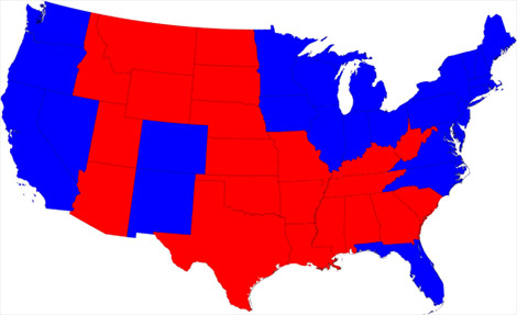
Hmmm… more red than blue. How can that be? Didn’t Barack Obama win? The problem is a traditional map ignores popluation density. Let’s rescale the map based on popluation.
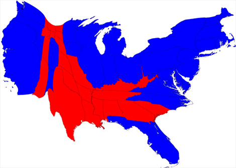
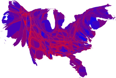
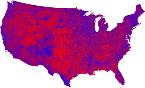
Look’s goofy but it’s a more accurate representation in comparing red states to blue. It’s easier to see how Barack Obama won. But no one state is ever 100% democratic or 100% republican. In fact, it’s rare for a county to be 100% of one party. So, let’s start with a county based map and finesse it by using red, blue and shades of purple to indicate how a county’s vote was divided.
Now, let’s factor in population density by county and voila:
Odd looking but it is a more accurate representation of how everyone in the lower 48 voted last week.
For more information: Mark Newman’s Web Page
If you are interested in how information is displayed I also recommend Edward Tufte’s classic book, Envisioning Information.